Whereis
6 months
2025
Figma
RTL Admin Dashboard
interactive map
payment gate way
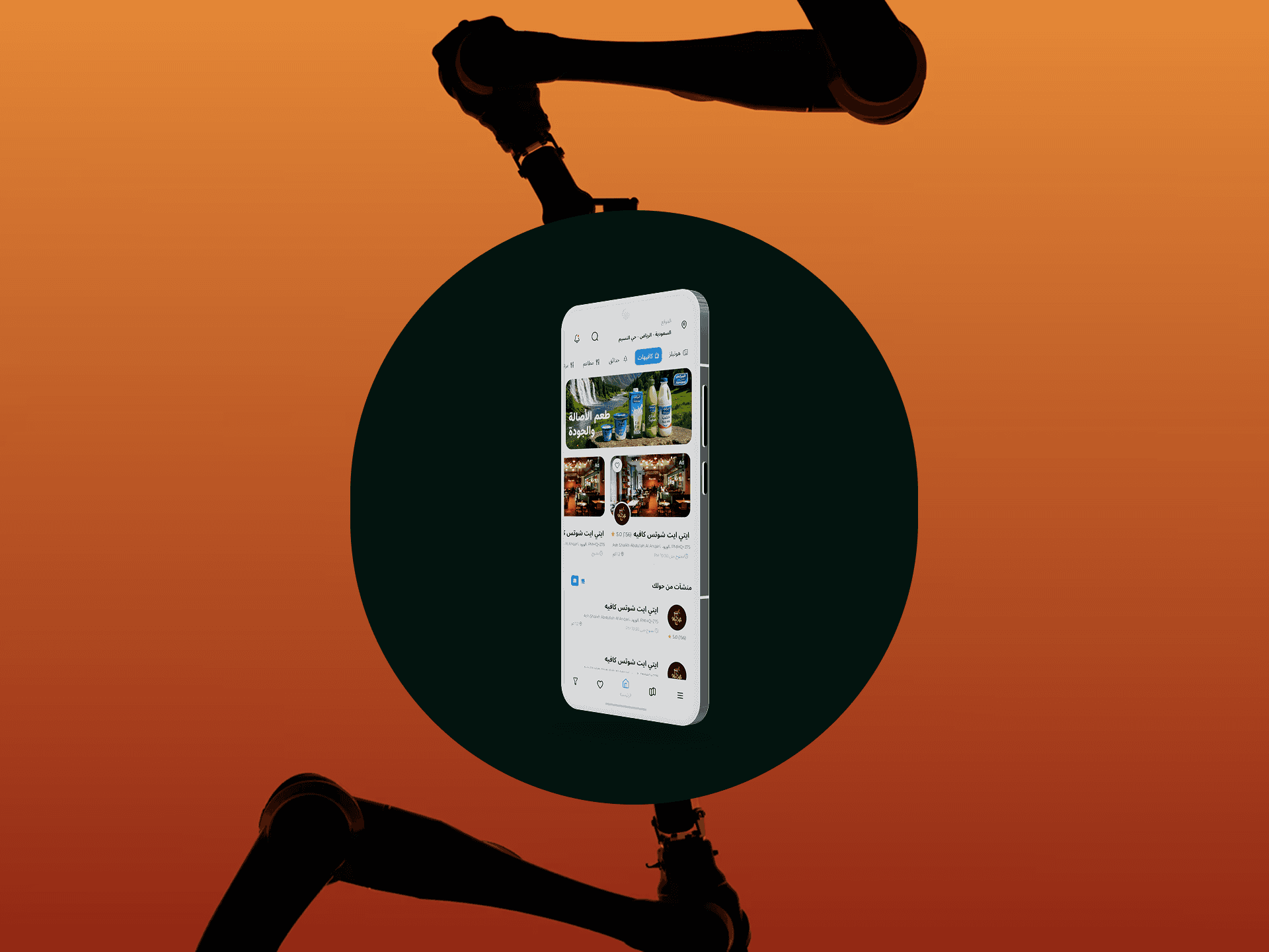
WHERE IS is a comprehensive Arabic-language location discovery and mosque management platform designed for Saudi Arabia, the platform combines business listings, mosque information, and analytics in a modern, user-friendly interface.

Designing WHERE IS required translating Western UX best practices—developed primarily for Left-to-Right (LTR) interfaces—into a native Right-to-Left (RTL) Arabic experience. This wasn't simple mirroring; it demanded rethinking fundamental UX principles while maintaining intuitive usability.
I simplified the user flow and restructured the layout to make navigation more intuitive. Key interactions were redesigned to reduce friction and guide users more naturally through the experience. I applied a modern design system with improved spacing, contrast, and visual hierarchy. This made the interface cleaner, more accessible, and easier to scan at a glance.
WHERE IS launched in Riyadh. Within six months, users requested expansion to Jeddah, Dammam, Mecca, and Medina. Business owners asked for advanced features: reservation systems, loyalty programs, integrated payments for services. International visitors sought English-language support for tourism.
The platform we built wasn't an endpoint—it was a foundation for reimagining how people discover, evaluate, and connect with the physical spaces that shape their daily lives. A foundation built on research, respect, and the radical belief that the best technology doesn't ask users to change—it changes to serve them.
The UX Phase: became an exercise in unlearning. Every Western pattern I'd mastered had to be questioned: Does the F-pattern work when eyes naturally move right-to-left? How do you create hierarchy when the visual anchor is on the right? What does "intuitive" mean for RTL users? . I mapped four complete user journeys for each persona.
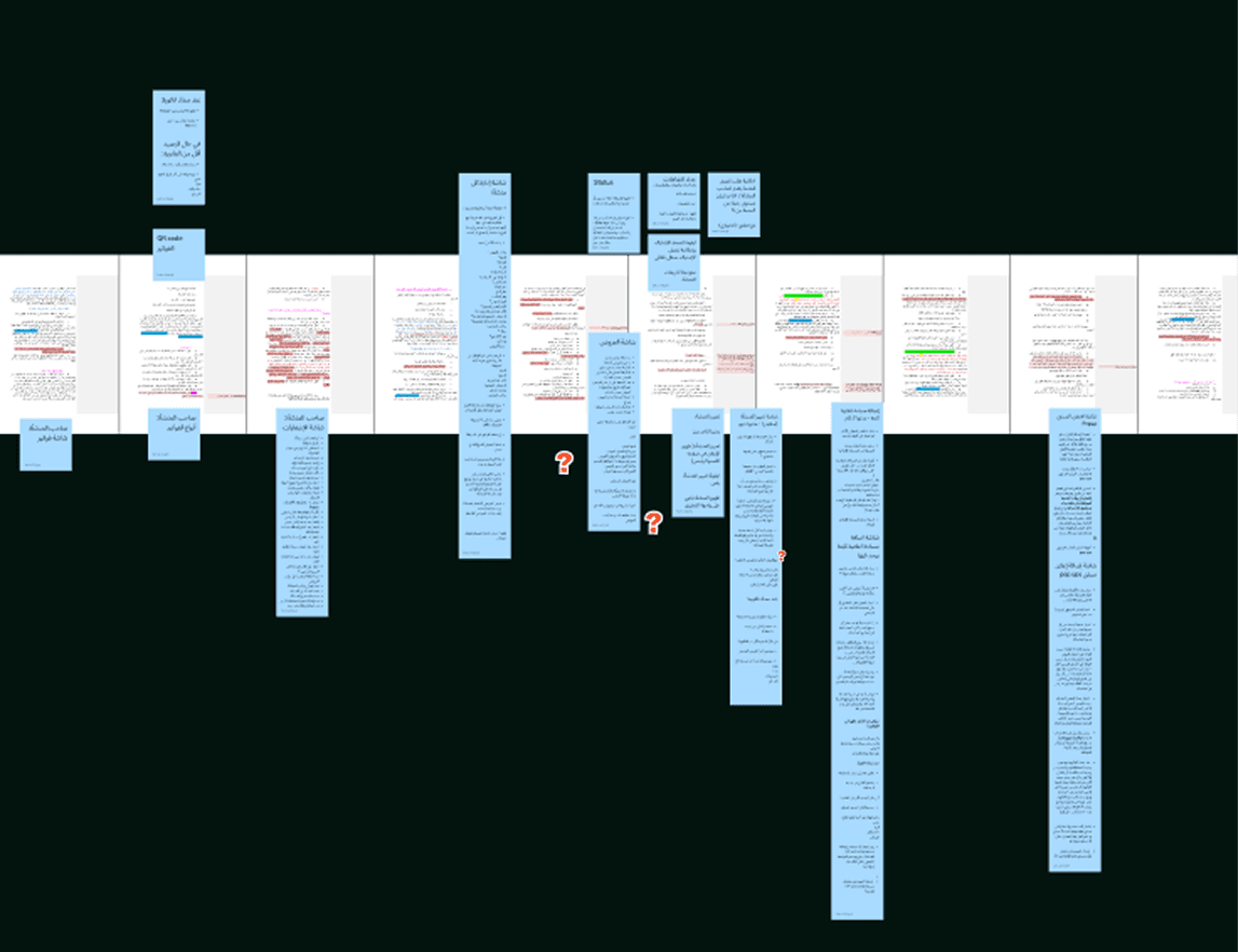
The Typography Decision was very important. I evaluated eight Arabic typefaces and chose Almarai because it solved multiple problems: designed for screens, handled mixed Arabic-English gracefully, struck the perfect tonal balance (modern without being cold, professional without being corporate), and made complex data feel approachable. A typeface became a silent ambassador of our values.
The UI Phase: I built a design system with 50+ RTL-optimized components tested on devices Saudi users. Colors communicated the business goal: blue for trust, green for offers, and gold for ratings. Every interaction respected Arabic mental models: swipe-right to go back, visual weight placed right, actions positioned top-left where scans ended.
The platform we built wasn't an endpoint—it was a foundation for reimagining how people discover, evaluate, and connect with the physical spaces that shape their daily lives. A foundation built on research, respect, and the radical belief that the best technology doesn't ask users to change—it changes to serve them.
